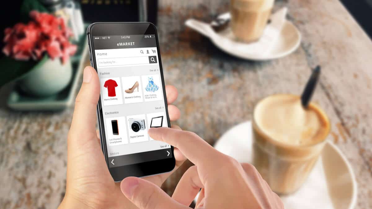
You can have amazing blog content, provide excellent customer service, and have a huge presence on Instagram. But, all the eCommerce marketing in the world won’t help if your product page stinks.
Your product page is what pushes shoppers down that final stage of the eCommerce funnel—from desire to action, and from browsers to buyers.
So how do you create a product page that converts? Read on and we’ll reveal the best practices of eCommerce product page design, along with examples to inform and inspire!
7 best practices of eCommerce product page design
The best product pages all have seven things in common. What makes the best stand out from the rest is how they use and improve upon those elements.
Below are these seven best practices for you to follow when designing your own product pages. We’ve also included bonus tips to take your product pages to the next level!
1. Awe and impress with premium product photography
Each of your product pages should feature at least one fantastic feature image, along with a gallery of additional photos. Why? It’s simple: photos sell.
The feature image is the photo that appears on the product category page, as well as when people share your product listing on social media. Either way, it’s the photo that gets people to click through to your product page. Make sure this photo features your product front and center, ideally against a light background with no shadows.
People like being able to view more photos when browsing eCommerce sites. It helps replicate the process of examining a product in a brick-and-mortar store. Consider expanding your photo gallery to show your product in action on a model, include lifestyle photography, or display your product from additional angles, such as the side or top.
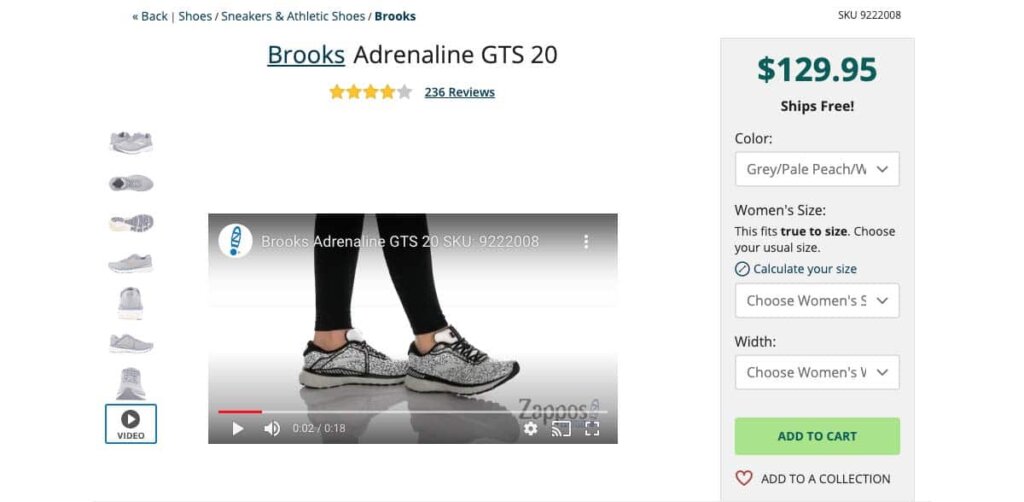
For example, Zappos shows a photo of each shoe they sell from multiple angles, and includes a video of a model walking in the shoes, to give shoppers an idea of how the shoes feel and look in motion.
Pro tip: Leverage video and interactive media. 64% of shoppers make a purchase after watching branded videos. Boost sales (and reduce returns) by adding product videos, 360° video, or AR functionality to invite shoppers to engage with your product virtually.
2. Keep key details above-the-fold.
Beyond the product photo, the first things your visitors should see on the product page include key product details, like the product name, price, size or subscription options, and the CTA button.
Personalised dog shop Yappy.com does this well. All of the important information appears above-the-fold. They invite shoppers to “Pick a Color” and “Choose a Size.”
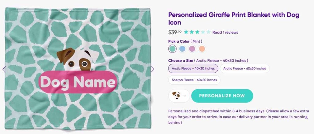
Clicking the “Personalize Now” CTA Button walks them through a short interactive quiz about their dog breed and name.

Once shoppers complete the quiz, the entire site changes the product names and photos to reflect the shoppers customisation selections.
Pro tip: Make it personal. Frame your size and customisation options as a “build your own adventure” for shoppers. Invite them to choose options so they feel that you are making a product just for them.
3. Inspire action with a strong CTA
The CTA, or call-to-action, button should also appear above-the-fold. If a shopper already knows they want to buy, don’t make their life any harder by forcing them to scroll.
In addition, the CTA should be highlighted visually with a different color than other text on the page. Research indicates contrasting colors perform better.
As for what it should say, you can’t go wrong with the classic “Add to Cart.” Or, you can instill a sense of urgency with “Buy Now.”
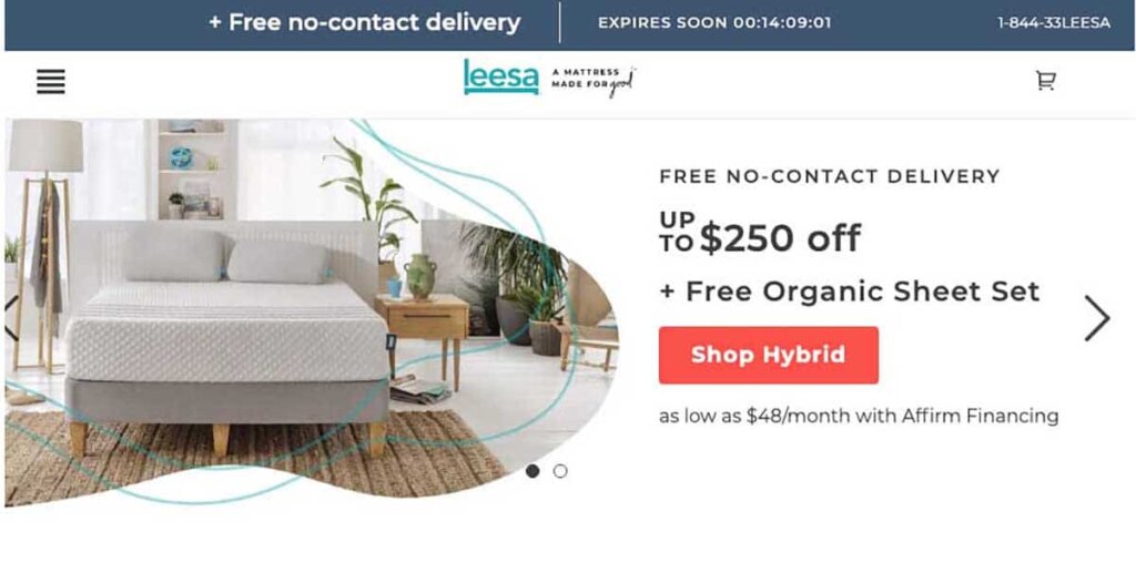
Take mattress brand Leesa’s eCommerce CTA design for example. There’s a lot going on on this page, but the CTA to Shop stands out due to the bright salmon color:
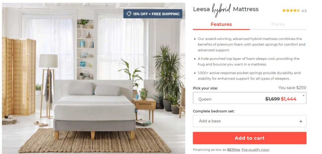
They use the same color for the CTA on their product page:
And throughout their checkout flow:
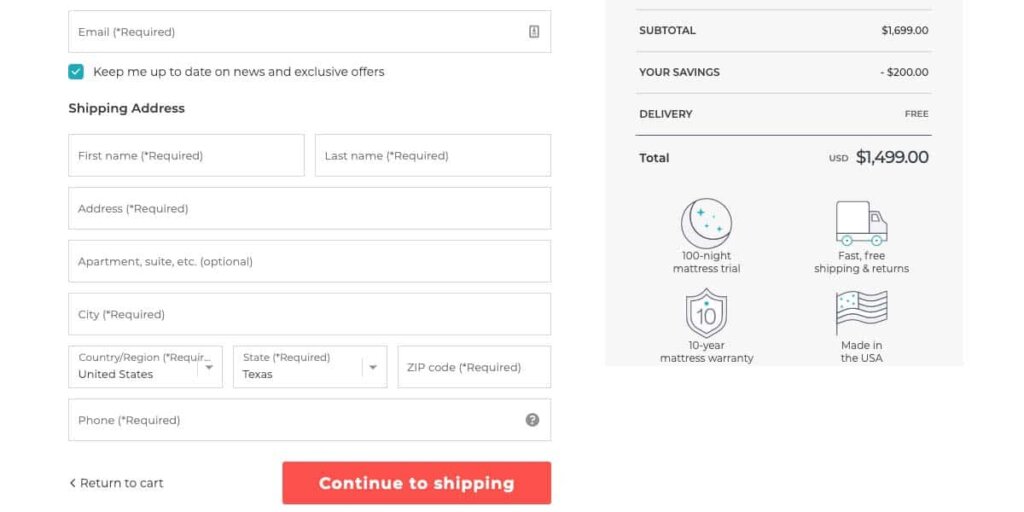
Pro tip: Adopt the same design for CTA buttons across your eCommerce site. This creates familiarity with the shopper and lessens confusion. Your Shop, Buy, and Checkout buttons should all look similar.
4. Include a unique product description
A photo with a few details may be all you need to get a shopper to convert. But, some shoppers will want more information. That’s where your product description comes in.
This section of your product detail page should include a unique description of your product, with an emphasis on unique. Optimise your product description to reflect your target SEO keywords for the page, while making the product sound attractive to your shopper.
Speak to the needs of your target audience, and reflect them in the tone for your product description. For example, the description of a hardware product should sound very different than that of a fashion item. The shoppers have different needs.
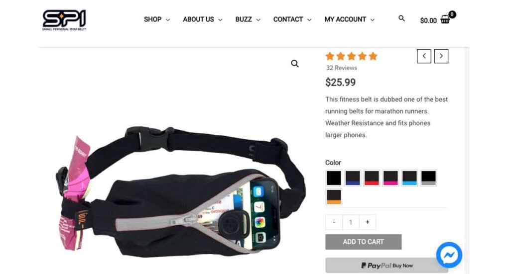
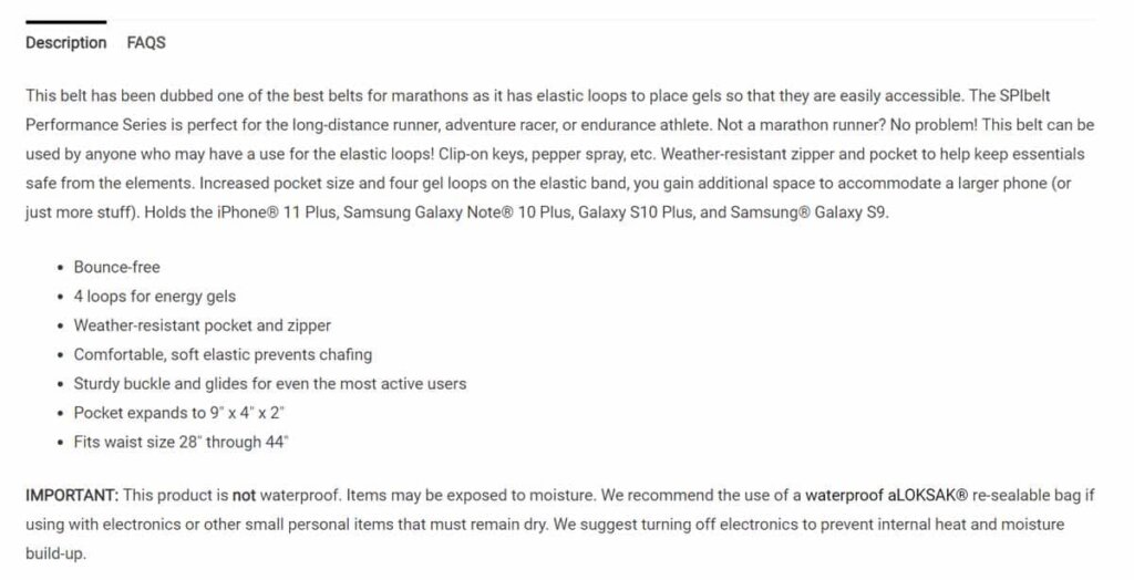
Running accessory SPIBelt shows a three-pronged approach to their product description. The initial, above-the-fold content features a two-sentence description. This is essentially the USP of the product.
As they scroll down, shoppers can view a full product description, which focuses heavily on benefits, before outlining the features in a bulleted list.
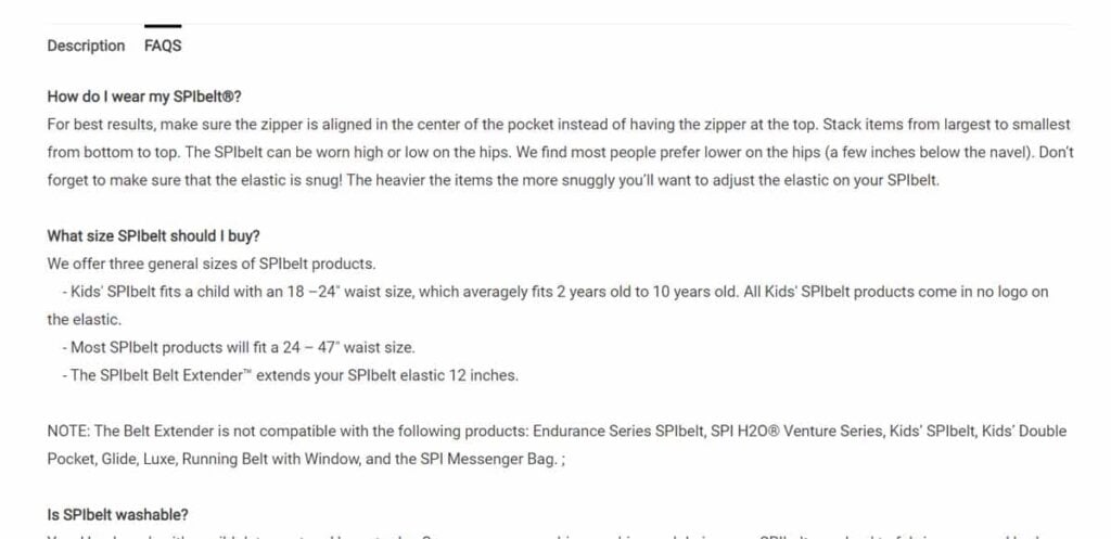
Finally, shoppers who have more questions can toggle over to the FAQ tab to view even more information.
Display this information using expandable drop-down boxes. Avoid overwhelming the shopper with text.
Make sure you focus on benefits before features. Benefits are what get shoppers to buy, not features. Tell shoppers how the product will improve their lives.
5. Reduce hesitation with social proof
Social proof includes trust-building elements like ratings, reviews, and social media posts from customers. 95% of shoppers consult online reviews before they buy. Shoppers are more likely to purchase from eCommerce sites with user reviews, and having 50+ reviews for your product can lift conversion rate by nearly 5%.
Reading reviews helps persuade shoppers to purchase your product. Seeing images of real customers using your product helps them feel like they are part of a group, further nudging them to purchase.
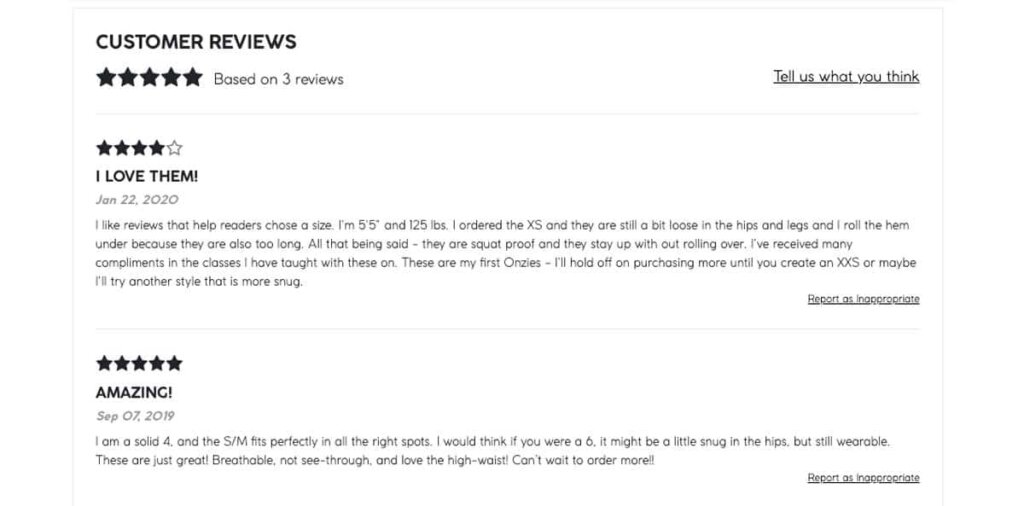
Incorporate reviews and social proof into your eCommerce product page design like yoga brand Onzie does. Right beneath their branded photo gallery, they include a gallery of images pulled from Instagram featuring the product:
They also display customer reviews further down the page:
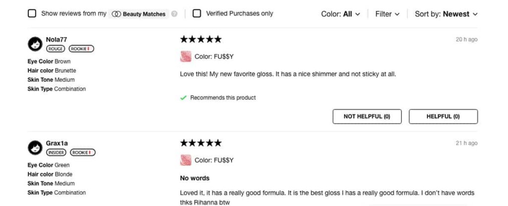
Pro tip: Ask for key information to display personalised review. Beauty retailer Sephora asks shoppers about their hair, eye color, and skin type whenever they leave a review. Shoppers can create a Beauty profile on the site where they fill in this information for themselves, and then filter reviews by their Beauty Match to view the most relevant ones.
6. Be helpful with FAQ and customer support
Sometimes people need a bit more help. Make it easy for them to find by offering no shortage of FAQ and customer service options on your eCommerce product page.
83% of shoppers need customer support to complete their purchase, and many of them expect it to be instant. Chatbots can be programmed to answer common FAQs and free up your team’s time.
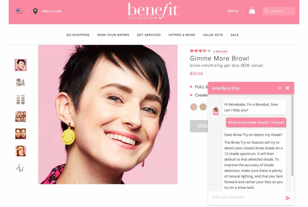
Chatbots can also serve as a personal shopping assistant, guiding visitors toward the best products for them. Here’s an example from a product page for Benefit Cosmetics:
Add product FAQ on your product detail page. This can include common questions, such as how to clean and use your product.
Make your shipping and returns policies noticeable and accessible. Add links to them on your website header or footer. If you offer free shipping or returns, call it out via a sitewide banner. Provide a quick overview of the shipping and returns policies on the product page.
7. Always upsell or cross-sell
Finally, if someone is interested in this product, then why not try to get them to buy something else?
Cross-selling suggestions should be positioned as a way to increase the shopper’s value out of the product that initially caught their interest, and make them feel like you’re acting like their concierge, curating personalised product recommendations for them to consider.
Upsell and cross-sell suggestions should appear in a lower section of your product detail page, so as not to distract from the main CTA.
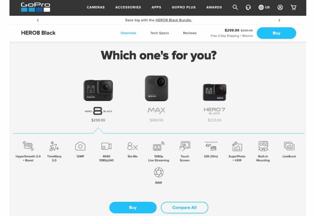
For example, GoPro invites users to find the best GoPro for them by comparing three similar options, beginning with the one they selected. The feature icons make it easy for shoppers to compare at-a-glance.
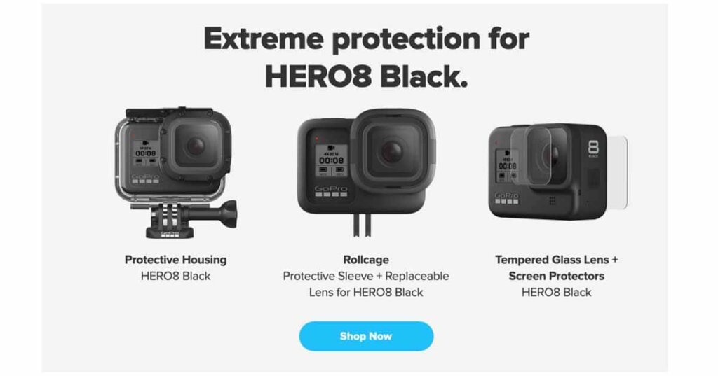
Further down the page, GoPro continues selling, by suggesting protective gear and accessories for the current product the shopper currently has selected:
Many sites display these as “Customers also viewed” to tap into herd mentality. Others will show “Related Products” to display similar products, perhaps from the same product line. There’s also the “You may also like” approach, which feels the most personal.
Pro tip: Capture future sales. If your product is out of stock, allow shoppers to enter their email to be notified when the product comes back in stock. Similarly, if shoppers aren’t ready to buy just yet, let them save products to their wish list.
Final words
Product pages have a hugely significant impact on the profitability of your online store. Online sellers spend a lot of time and money on generating traffic, but if your product pages don’t turn visitors into customers, it’s a wasted effort.
These seven foundations will help you to create a product page that converts. But it doesn’t stop here! Make sure you’re constantly analysing your eCommerce metrics, testing new things, and improving your product pages. Even small gains can make a massive difference over time!